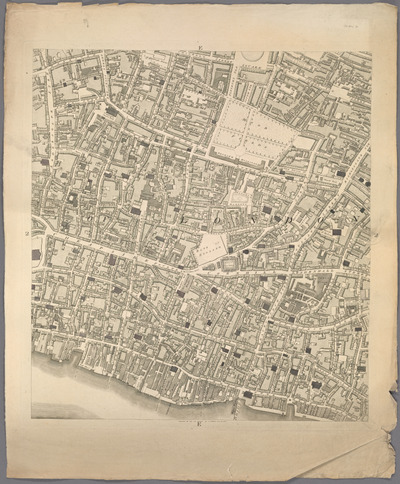
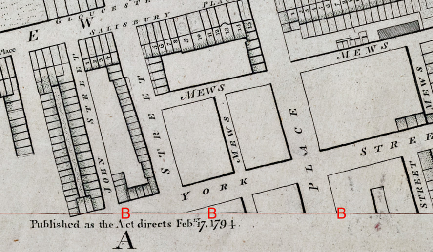
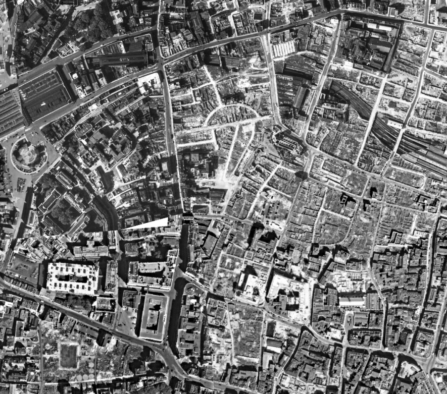
E2 Sheet of Horwood Map
Digital scans of the 20 sheets comprising the Ogilby Map were obtained from the Leslie Brown Collection;
images of the 24 sheets of the Rocque map were provided by the Library of Congress; and, for the Horwood map, digital scans of each of the 32 sheets were made available by the New York Public Library at a resolution of
300dpi.
As with any document over 200 years old (almost 350 years for the Ogilby map), the pages were not perfectly rectangular and, not only was the map portion
of each scan a true rectangle, but the edges, themselves, did not fall on a straight line from corner to corner.
So, for each scan, a rectangle was created in ArcPro in a decimal degrees coordinate system such that at least two of the map corners
matched a rectangle corner. In most cases, because of the maps being skewed, only two corners were able to be fitted.
Each corner of the map was then georeferenced to a corner of the rectangle using a projective transformation. This assured that the edges would
align vertically and horizontally, ie., that the top-left and top-right corners were at the same level or the top-right and bottom-right corners
were directly aligned vertically, etc.
This would be enough to mosaic all the images so that the corners matched but, prior to doing that, the images were further corrected to
"rubbersheet" them fully to the rectangle, ie, so the corners and the edges matched. Rubbersheeting is a process by which an images is
distorted by stretching (inward and outward) small portions to straighten them and to align the map border with the rectangle (see image pair below).
When the process was finished each edge formed a near-straight line.
As many as 100 points were used per sheet to align the image to as true a rectangle as possible. This was an iterative process where the first set of
adjustments were made to straighten most of the image. The image was then exported and a cropping rectangle overlain on the edges. Areas of each
edge were identified where adjustments were still necessary and those areas were then corrected and the image exported again and examined. This
process continued until the image was deemed fully aligned. This set of steps took an average of an hour per sheet.
Original Image RubberSheeted Image
The process of aligning and rubbersheeting started with image D2 from the index grid below, and each subsequent image was appended to it using
ImageMagick image editing software.
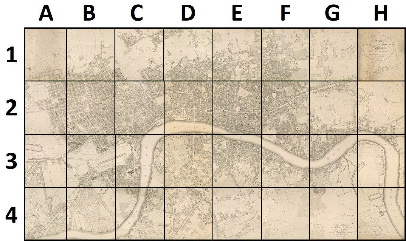
Index of Horwood Map Sheets
The third sheet added was D3 and, using the same steps as above, the top edge was aligned to the bottom edge of D2. Starting with sheet E3, this
process doubled since the alignment of two edges now had to be verified. Once this central section of four sheets had been compiled, the full
map was successively built outward around this core set of images using the same process. The finished result was a 3.521gb TIFF image with dimensions
of 47999x26240 pixels (1,259.5 megapixels).
Once the seamed image had been created, the TIFF was reloaded as an image layer into ArcPro and the process was started to identify features on the map
that were still in existence in modern-day London in order to georeference it. A spline transformation was again used to georectify the image, that
is, to give it a coordinate system so that it could be overlain on a map.
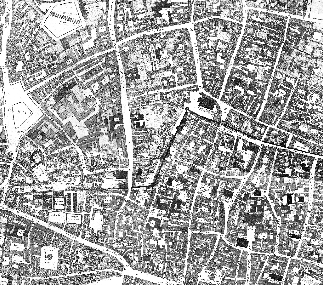
There are many points that have lasted through time and could be used to reference the map. Some of these were the turrets of the London Wall near
St. Giles Cripplegate, the Statue of Queen Anne in front of St. Paul's Cathedral, the Statue of Charles I at Charing Cross, etc. Unfortunately,
many areas have no resemblance to the past, having been forever changed in the Blitz. Ironically, the Blitz and air photos taken by the Royal
Air Force in the days, weeks, months, and even years after served as a guide to referencing the old maps, especially in the area of Old London.
The devastation of the bombing leveled major parts of the city, leaving only an eerie network of streets and some foundations visible. Incredibly, a great
number of these streets had remained mostly unchanged in shape through the centuries. With the map image anchored in several locations to landmarks that
had persisted through the centuries, a second effort was begun to georeference some of the 1940s RAF photos. This was a much easier process since they
were actual photographs and far less numbers of points were required to reference them to the real world. Once this was completed, the scanned paper
maps of Ogilby, Rocque, and Horwood could be referenced in areas where absolutely no landmarks survived. These were areas such as the Barbican, the area
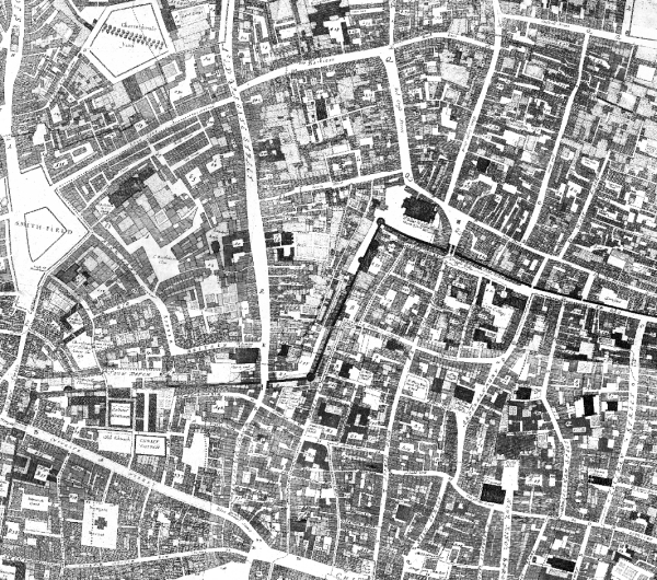
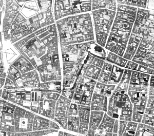
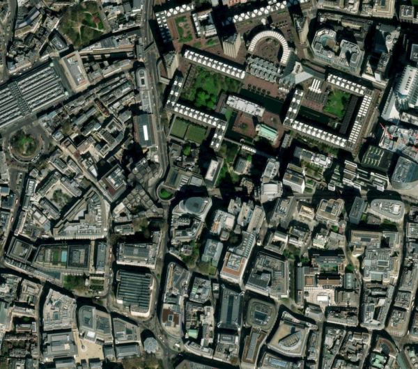
south and east of St. Paul's, immediately west of The Tower, and many other places. The sequence of maps below show the similarities of Ogilby's map to
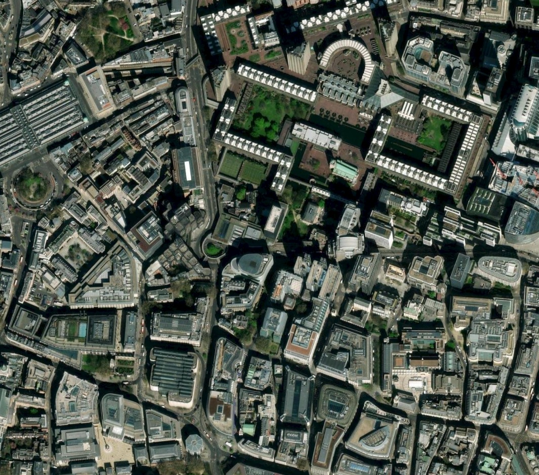
the Royal Air Force aerial photographs taken after the Blitz almost 275 years later. Contrast these with the third image of the same area from Google Earth from 2022,
80 years after the Blitz.
Ogilby 1677 Royal Air Force 1945 Google Earth 10 Aug 2022
Use the image slider below to compare the Ogilby 1677 map to the Royal Air Force aerial photograph.
The map slider below allows you to compare the Royal Air Force aerial photographs with the GoogleEarth image of 10 August 2022.
Below is a slider comparison of the Ogilby map and the GoogleEarth image of 10 August 2022. Some main streets such as Newgate, Aldersgate, Cateaton, etc are still generally
in the same place but the present-day Barbican bears no resemblance to the area as it was in 1677.
A Geoserver was then set up and tiles at various resolutions were created from the large image. This allowed high-quality overlay images to
be served through an Openlayers server permitting the user to view the current city of London and then view the 220-year old map on top of it.
Adding the 17th and 18th Century Maps
The maps of the city that are available to overlay on the online map viewer were painstakingly prepared for this application and served as the base for
locating and digitizing many of the streets, alleys, courts, etc. that have been lost to time. The maps are:
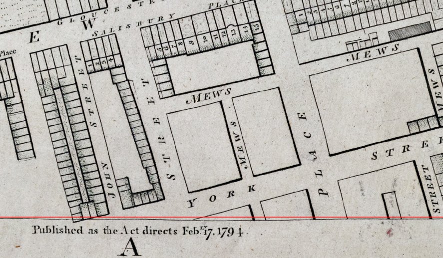
 The second image to be aligned was E2, and after it had been transformed, it was appened to D2 and the edge between the two was examined. Because each
of these sheets was originally drawn at different times, lines did not always match across sheets and often buildings had been constructed in areas
on one sheet where there was open field on an adjacent and earlier sheet. Every attempt was made to digitally align the two sheets; an iterative process
which required going back and shifting lines slightly, re-exporting the image, appending the sheets, and reexamining the seam.
The second image to be aligned was E2, and after it had been transformed, it was appened to D2 and the edge between the two was examined. Because each
of these sheets was originally drawn at different times, lines did not always match across sheets and often buildings had been constructed in areas
on one sheet where there was open field on an adjacent and earlier sheet. Every attempt was made to digitally align the two sheets; an iterative process
which required going back and shifting lines slightly, re-exporting the image, appending the sheets, and reexamining the seam.


 ×
×